- Artist
- Victor Pasmore 1908–1998
- Medium
- Oil paint on canvas
- Dimensions
- Support: 457 × 610 mm
frame: 750 × 895 × 120 mm - Collection
- Tate
- Acquisition
- Purchased 1951
- Reference
- N05974
Display caption
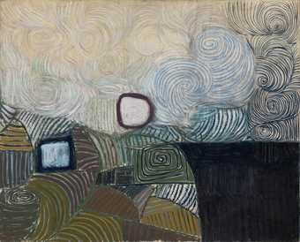
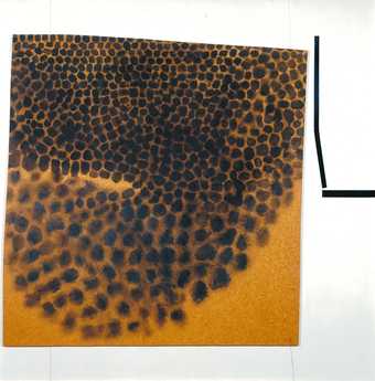
Most of Pasmore’s ‘square motif’ works date from 1948–50. They are constructions of shapes such as spirals, rectangles, triangles and circles, which can be found in nature.
The way these elements are combined could be seen to represent Pasmore’s emotions and ideas, rather than just an arrangement of shapes and patterns. Although he sought to create balanced compositions, he stressed that he wished to express human feelings, not abstract ideas.
Gallery label, April 2019
Does this text contain inaccurate information or language that you feel we should improve or change? We would like to hear from you.
Catalogue entry
Victor Pasmore 1908-1998
Square Motif, Blue and Gold: The Eclipse
1950
N05974
Oil on canvas 457 x 611 (18 x 24)
Purchased from the artist through the Redfern Gallery, London (Knapping Fund) 1951
Exhibited:
Victor Pasmore; London Painter-Printers; John Harrison; French Paintings and Original Prints, Redfern Gallery, London, Dec. 1950-Jan.1951 (8)
Victor Pasmore: Retrospective Exhibition 1925-65, Tate Gallery, London, May-June 1965 (88, pl.35)
Henry Moore to Gilbert and George: Modern British Art from the Tate Gallery, Palais des Beaux Arts, Brussels, Sept.-Nov. 1973, as part of Europalia 73 Great Britain (64, col. repr. p.83)
Forty Years of Modern Art, Tate Gallery, London, Feb.-April 1986, (no number, col. repr. p.51)
Victor Pasmore, Yale Center for British Art, New Haven, Conn., Nov. 1988-Jan. 1989, The Phillips Collection, Washington D.C., Feb.-April 1989 (21, repr. 33)
Literature:
Mary Chamot, Dennis Farr and Martin Butlin, Tate Gallery: The Modern British Paintings, Drawings and Sculpture, II, London 1965, p.508
‘Pasmore’s Road to Abstract Art’, Illustrated London News, 15 May 1965, p.28, repr. p.29
Victor Pasmore 1950-1967, exh. cat., Musée des beaux-arts et de la dentelle de Calais 1985, p.8
Alan Bowness and Luigi Lambertini, Victor Pasmore, with a Catalogue Raisonée of the Paintings, Constructions and Graphics 1926-1979, London 1980, p.294, no.153, repr. p.87 (col., as Abstract in Blue, Gold, Pink and Crimson, The Eclipse)
Reproduced:
Victor Pasmore, exh. cat., Galerie Charles Lienhard, Zurich 1963, p.[23] (as The Eclipse, Square Motif in Blue and Gold, 1949)
Ronald Alley, British Painting Since 1945, London 1966, front cover (col.)
Grey Gowrie, ‘The Twentieth Century’, David Piper (ed.), The Genius of British Painting, London 1975, p.314 (col., upside down) Andrew Forge (ed.), The Townsend Journals: An Artist’s Record of his Times 1928-51, 1976, p.85
The Tate Gallery: An Illustrated Companion to the National Collection of British and Modern Foreign Art, 1979, p.130 (col.)
Norbert Lynton, Victor Pasmore: Nature into Art, exh. cat., Centre for International Contemporary Arts, New York 1990, p.23, fig.8 (as Abstract in Blue, Gold, Pink and Crimson: The Eclipse)
The 1940s in Britain saw a growth in the reputation of the work of Paul Klee, who had died at the beginning of the decade. Pasmore has acknowledged his debt to Klee, whose Sun and Town, 1928, on loan to the Institute of Contemporary Arts from the Penrose Collection in February 1948, was a major inspiration behind his move to abstraction. His first abstract painting, Square Motif: Green and Lilac, 1948 (private collection)[1]
bore a considerable similarity to the Klee. Square Motif, Blue and Gold: The Eclipse is a late development of that theme and reveals the persistent debt to Klee’s painting and, perhaps, to his On Modern Art, published in Britain in 1948. Most particularly, Pasmore adopted Klee’s belief that art should emanate from, rather than imitate, nature. This belief also underpinned Matila Ghyka’s application of natural proportion to artistic composition in The Geometry of Art and Life, 1946, upon which Pasmore is known to have drawn.[2]
An earlier Tate Gallery catalogue noted that the square motifs in Pasmore’s work of 1948-50 generally pre-dated the spiral motifs which started in 1950.[3] The swirling spirals in Square Motif, Blue and Gold: The Eclipse identify it as one of the last of the earlier group and the artist confirmed the date in conversation with a Tate Gallery curator on 24 September 1956. The painting was shown at the Redfern Gallery in December 1950 in an exhibition comprising square, rectangular, spiral and triangular motifs, including Spiral Motif in Green, Violet, Blue and Gold: The Coast of the Inland Sea (Tate Gallery N06191); Pasmore’s statement about the work in that exhibition was later published as ‘The Artist Speaks’.[4] There he said that he did not abstract forms from nature but based his works on formal elements which were to be found in nature. The combination of different elements during the painting process, he wrote, evokes different emotions. This echoed Klee’s detailing of the various effects produced by different linear, tonal and colour elements. The rich, contrasting colouring of The Eclipse reflects that theory.
The conjunction of such concrete elements as the square or triangle with personal feeling was part of Pasmore’s search for a visual art form analogous to music. He saw this as continuing the project articulated by the Post-Impressionists in their writings: the search for an objective expression of human emotion. In particular it reflects his reading of Cézanne, whom he quoted in his article: ‘The painter objectifies his sensibility, he makes a concrete object and gives it individuality. He creates a harmony parallel with the harmony of nature’.[5] For Pasmore, as for Klee, the painter constructs pictorial elements logically, like blocks, to achieve an object that is formally balanced. The analogy between painting and music also echoes the writings of Kandinsky, English translations of which were published in the late 1940s. While Klee wrote in generalised terms, Kandinsky’s Point and Line to Plane set out a detailed theory of the effects of different colours and forms and configurations of the two.[6] The combination of areas of cross-hatching in different directions, and of triangles, squares and circles in a variety of contrasting colours and tones epitomises much of Kandinky’s proposal.
The darkened sun, a feature of a number of Pasmore’s works of 1949 and 1950 which echoes the black sun recurrent in Kandinsky’s painting, was the source for this picture’s sub-title. While Pasmore’s title clearly invokes Whistler’s Nocturne: Blue and Gold - Old Battersea Bridge, 1872-7 (Tate Gallery N01959), the application of such a lyrical title to an objectively achieved work reflects Klee’s proposal that, after the completion of a painting, the artist, like the viewer, may identify associations evoked by it. Nevertheless, Pasmore had used similarly Whistlerian titles for his earlier paintings of the Thames: The Quiet River (Tate Gallery T00197) and Evening Star (private collection),[7] for example. Despite the claims for Square Motif’s objectivity, that group of pictures, in particular Evening Star, included a number of precedents for the forms in the later work. Specifically, squares and triangles, derived from riverside signs but free-floating as if abstract, anticipate those in Square Motif. The use of a horizon that divides the composition into two equal parts is another feature of Square Motif seen earlier in The Quiet River and The Gardens of Hammersmith No.2. Similarly, the motif of a centrally positioned sun is reminiscent of a number of earlier landscapes, most conspicuously Sun Shining through Mist: The Thames at Chiswick (National Gallery of Victoria, Melbourne)[8] in which one can see that the sun had originally been as low-lying as in Square Motif.
Photography under raking light and X-Ray reveals that Square Motif, Blue and Gold: The Eclipse was considerably reworked. The main horizontal division was originally higher, passing just above the dark sun, and the area immediately below it was subdivided vertically like the lower section of The Eclipse. The X-Ray also makes it clear that the composition of the bottom half of the final painting is dominated by several large squares. Earlier, this area included spiral forms and serpentine curves, arranged vertically, and included another circle near the bottom, underneath the blue triangle. Certain areas of the final layer of paint are very lean and drying crackle has developed, suggesting that they were applied over partially dried paint. The crackling reveals the colours of much of the underlying composition, particularly in its upper part, which was predominantly a dark indian red. The canvas was restretched and the red underpainting continues over its upper edge, indicating that the original image may have been larger. This suggests that the final picture is not simply a development of the earlier campaign of work, so the close relationship between the obscured rectangular forms and those on the final painting may indicate that more than one underlying image has been painted over. The texture of the upper half of the composition was achieved by Pasmore’s addition of ‘sand or something similar’
to the gold paint.[9]
In the same interview the artist was unable to explain a number of pin-holes in the painting which were made after the paint was applied.
Chris Stephens
Feb. 1998
[2] Alastair Grieve, Victor Pasmore, exh. cat., Arts Council, London 1980
[4] ‘The Artist Speaks’, Art News and Review, vol.3, no.2, 24 Feb. 1951, p.3
[6] Wassily Kandinsky, Point and Line to Plane, trans. Howard Dearstyne and Hilla Rebay, 1947
Explore
- abstraction(8,615)
-
- non-representational(6,161)
