- Artist
- Patrick Heron 1920–1999
- Medium
- Oil paint on canvas
- Dimensions
- Support: 1520 × 2138 mm
- Collection
- Tate
- Acquisition
- Purchased 1974
- Reference
- T01878
Display caption
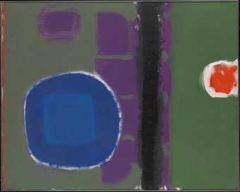
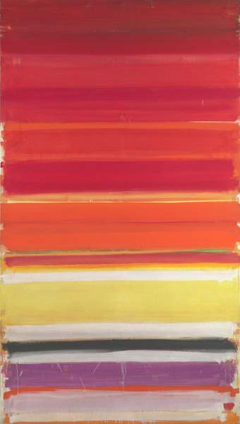
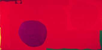
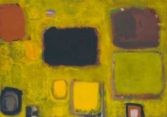
Heron painted this work over a period of eleven months, from August 1958 to July 1959. From 1957 he had begun to experiment with vertical and horizontal bands of colour in his paintings. With this particular work Heron now combined both elements on the same canvas. Built up over time, the different layers of colours intersected, overlapped and ate away at one another, creating the soft-edged square shapes now visible. As the artist himself explained: 'I did not draw these shapes in this configuration - the shapes and their relationship grew out of this process of allowing each colour area to adjust physically to adjacent colour areas'.
Gallery label, September 2004
Does this text contain inaccurate information or language that you feel we should improve or change? We would like to hear from you.
Catalogue entry
T01878 BROWN GROUND WITH SOFT RED AND GREEN: AUGUST 1958–JULY 1959 1958–9
Inscribed on reverse ‘Patrick Heron’, ‘TOP’ with arrow, ‘BROWN GROUND (WITH SOFT RED AND GREEN) AUGUST 58–JULY 59’ and ‘5 ft.×7 ft.’
Oil on canvas, 60×80 (152.5×203)
Purchased from Mrs Susanna Ward (Grant-in-Aid) 1974
Coll: The artist; with Bertha Schaefer Gallery, New York, 1960–67; given by the artist to his daughter Susanna Ward 1967
Exh: Patrick Heron, Bertha Schaefer Gallery, New York, April–May 1960 (15); Patrick Heron, retrospective exhibition, Richard Demarco Gallery, Edinburgh, June–July 1967 (58, repr. no.15); Patrick Heron, Museum of Modern Art, Oxford, May–June 1968 (12); Patrick Heron, Whitechapel Art Gallery, June–July 1972 (15. repr. in colour but inaccurately)
Lit: Ronald Alley, ‘Patrick Heron; the development of a painter’, Studio International, CLXXIV, 1967, pp.18–25, repr. p.19; Patrick Heron, ‘The Shape of Colour’, Studio International, CLXXXVII, 1974, pp.65–75 (The text of the 6th Power Lecture given at the Power Institute of Fine Arts, University of Sydney, 22 June 1973)
Repr: Patrick Heron; Retrospective, EM46, ESM Documentation, New York, 1970, colour slide 48
The following entry is based on information provided by the artist in a letter to the compiler of 21 July 1975, from which all quotations are derived unless otherwise stated.
Following its exhibition at the Bertha Schaefer Gallery where it arrived in January 1960, T01878 remained in the United States until April 1967 when it was returned to the artist and hung in his home in Cornwall.
It was painted in the artist's studio 5 Porthmeor Studios, St Ives, between August 1958 and July 1959 (as specified in the title), with Roberson's oil paints on a commercially primed canvas. In December 1960 Heron listed it as one of his ‘chief works’ to date (an opinion he still maintains) on a biographical form completed at the request of the Tate Gallery. It was as large as any of his abstract paintings at that time, with the exception of the mural commission ‘Horizontal Stripe Painting: November 1957–January 1958’ (T01541), taking eleven months to complete and spanning almost the entire period covered by the paintings in his first one-man exhibition in the United States at the Bertha Schaefer Gallery. In a letter of 21 October 1975 the artist stated that he started work on T01878 ‘only a month or two’ after having taken over the Porthmeor studio from Ben Nicholson and it ‘was the immediate result, I suppose you could say, of getting that superb space to work in’.
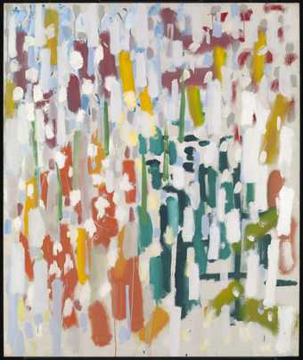
The genesis of the painting was described by the artist as follows: '... there's a point in The Shape of Colour (op.cit, p.71) where I explain, what only became apparent to me in retrospect, reviewing my own development years after the event, that just as the first stripes, which were vertical, grew directly out of the continually lengthening vertical brushstrokes or gestures which were characteristics of the later paintings of my tachist period (January 1956 into the spring of 1957)... in the same way the first soft-edge squares in my painting resulted from the vertical and the horizontal bands crossing over one another in the same canvas-the square coming into existence at the point of intersection, rather like the squares in a tartan. You can see this in quite a number of the paintings shown alongside the vertical and horizontal stripe paintings in my Redfern Show of February 1958, the earliest perhaps being ‘Red Ground: May 1957’ (1). These soft squares were even more in evidence in ‘Squares in deep cadmium: January 1958’ which was also included in the Redfern stripe exhibition (4). The general point being that the stripes, in the first place, and the squares in the second, both materialized out of a handling of the brush, and of paint, typical of that moment with me, as it were, and did not therefore result from a conscious decision to make stripes or squares.
'Looking back, I think it is obvious that from 1958 onwards, with the stripes breaking-up into soft-edge squares and giving way to them, there was a long period during which squares and lozenge shapes were being shuffled about on the picture-surface in a variety of ways, forming clusters which were always new and different in their relation to the edges of the canvas and to the main “ground” area-though “ground” is a term I came to disapprove of because it implies a negative space surrounding positive forms, and I've always felt very strongly that the largest colour-area i.e. the “ground”, must be as positive, as a colour-shape, as any of the other colour-shapes. So “ground”, which appears in the title of your picture, was really a misnomer. But this shuffling process continued until 1963, when I began again to divide the so-called “ground” into areas whose frontiers ran out of the edge of the painting. I've described these processes in The Shape of Colour. This entire period, 1958 to 1963, saw the smaller colour-areas floating in all-over configurations, as in your painting; or nearly disappearing altogether (there are paintings where only one small squarish lozenge survived in a picture format consisting solely of one colour e.g. “Red in red: September 1961”, or in a small picture entitled “One from: September 1959”); or floating exclusively to the right-hand side of an otherwise empty canvas, ranging themselves down the right-hand edge, e.g.! ‘Black painting-red, brown, olive: July 1959’ or “Orange painting (brown, ochre, black): January 1962” or reducing themselves to occasional islands, as in “Big green with reds and violet: December 1962”, where the three small lozenges are floating like stepping-stones in the huge green “ground”, along a diagonal reaching upwards from the bottom right-hand corner...And so on.
‘Coming at the beginning of this shuffling period, in which one was continually adjusting and readjusting lozenges and round-cornered squares to the “ground”, as well as to one another, the Tate's painting's great significance for me was that it was the most successful of the larger canvases in which I suppose I was arriving for the first time at the vocabulary which determined the formats of this “entire shuffling” period. The search for, and arrival at, this entire vocabulary was conducted very much in terms of over-painting, as you've noticed. One arrived at these soft-edged, squarish lozenges and round-cornered squares by the process of allowing them, first, to expand sideways or outwards into the “brown ground” and then to contract again, the “ground” eating into them, so that they diminished like sandbanks being eroded by a rising tide-the rising tide of brown! This process-of the expansion and contraction and expansion again of shapes: one thought at the time it was unending-was essentially a process of over-painting, again and again. Hence the time factor reflected in the title; with oil paint one has to wait for each successive version to dry out hard. All this one can see in the final version, which is, of course, superimposed upon all the others.
Most paintings of this 1958–63 period did involve the arrival at the final jigsaw of colour-shapes by allowing them physically to eat into one another-over-painting being the essential means. The pushing and pulling into and against each other of all the colour-shapes-in such a way, that the largest colour-shape (the “ground”) itself became a formal image in its own right, and in no sense a merely vacuous backdrop against which the other, smaller, individual colour-shapes are suspended: this would be totally wrong, and the very worst of faults. So the pushing and pulling of the colours was integral to the colour-shapes that resulted: I did not draw these shapes in this configuration-the shapes, and their relationship, grew out of this process of allowing each colour-area to adjust itself physically to adjacent colour-areas. T.1878, I feel, does reveal this entire process very visibly.’
Drawing attention to similarities between this picture and Adolph Gottlieb's ‘Transfiguration, September 1960’ (coll. Alistair McAlpine), Heron writes: ‘I’m sure you'll see the similarity between the large oval colour-shape in green in my painting and the upper oval form in the Gottlieb. Even the handling, the flat broad strokes managing to look feathery and light, and leaving those irregular fragments from a colour underneath-all this has been taken up by Gottlieb'. According to Heron, Gottlieb studied T01878 for two hours when it was exhibited at Heron's first show at the Bertha Schaefer Gallery, New York, 1960. This is substantiated by Bertha Schaefer who according to Heron wrote to him some years later saying: ‘...that she had always thought Adolph had got an awful lot from me [Heron]’. Delia Heron has pointed out that after his first Bertha Schaefer show Gottlieb began using titles similar to Heron's e.g. ‘Soft red in brown’-titles descriptive of colour instead of the word titles like ‘Burst’, Patrick Heron also told the compiler that after this time ‘Gottlieb's palette became brighter and lighter and more high-keyed and gay; and his surfaces became tighter in their handling, less solid and smooth, the weaving of the brush more sensitive and varied’.
Published in:
The Tate Gallery 1974-6: Illustrated Catalogue of Acquisitions, London 1978
Explore
- abstraction(8,615)
-
- non-representational(6,161)
-
- colour(2,481)
- irregular forms(2,007)
- formal qualities(12,454)
-
- space(177)
