- Artist
- Billy Apple 1935–2021
- Medium
- Lithograph on primed canvas with neon gas tube
- Dimensions
- Support: 951 × 749 mm
- Collection
- Tate
- Acquisition
- Presented by Tate Members 2013
- Reference
- T13876
Summary
Relation of Aesthetic Choice to Life Activity (Function) of the Subject 1961−2 shows four identical portrait-format black and white photographic images arranged in a grid and printed by offset lithograph on a primed linen canvas. The photograph is a found image of a customs officer in uniform wearing a hat. A red neon tick punctures and overlays the image positioned at the top left of the grid. The image was appropriated by the artist from an article in Ark, the magazine of the Royal College of Art (RCA) in London, where he was a student between 1959 and 1962. It was originally by Keith Branscombe and featured in ‘Twist Drunk, A Picture Story by Keith Branscombe’ (Ark, no.33, Autumn 1962, pp.18–26) that documented a dance party aboard the MV Royal Daffodil as it sailed across the English Channel, during which passengers were able to drink outside of normal licensing hours.
The neon tick indicates which image Apple felt was the best of the identical photographs. He explained that the work depicted, ‘A customs officer who inspects baggage, often making arbitrary decisions about who to check. I selected one of four photographs of the officer and “checked” it with red neon, singling it out for specific inspection.’ (Quoted in Serpentine Gallery 1974, p.9.) As such, the ‘aesthetic choice’ of the artist named in the title mimicked the ‘life activity’ of the depicted subject, emptying out the creative act from Apple’s artistic production and rendering it arbitrary. This work was the earliest by the artist to include neon, a medium he explored and developed further after he had moved to New York in 1963, with the solo exhibitions Neon Rainbows at the Bianchini Gallery in 1965 and Neons at the Pepsi Cola Gallery in 1966. The work is unique.
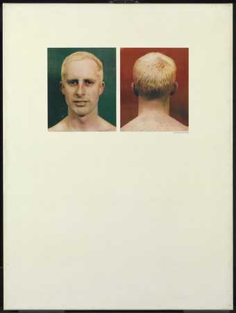
Relation of Aesthetic Choice to Life Activity (Function) of the Subject was made when the artist was still Barrie Bates, prior to his change of identity to Billy Apple in 1962. The title of the work provides a commentary surrounding the decisions he made when formulating this shift of identity. He was not alone in exploring opportunities for personal transformation. In the summer of 1961 Apple (or Barrie Bates as he then still was) and fellow RCA student David Hockney visited New York together for two months. The trip provided the context for the artists’ discovery and application of the hair colouring product Lady Clairol Instant Crème Whip. Hockney’s transformation into a blonde using this product was recorded in the third plate of his sequence of prints A Rake’s Progress, entitled The Start of the Spending Spree and the Door Opening for a Blonde 1961–3 (Tate P07033). Apple’s transformation, also catalysed by this trip, eventually took place on 22 November 1962 after he had graduated (the location chosen for this event was the studio and home of artist Richard Smith).
Although Apple studied graphic design at the RCA, he had been permitted to move freely between all departments after receiving special dispensation from the Head of Design, Richard Guyatt. In this climate he gravitated more towards the painting students than his fellow design students, and as a consequence he not only exhibited with his contemporaries in a number of the Young Contemporaries exhibitions, but in 1961 and 1962 also designed the posters and invitation cards. This background and the range of reference informs the ways in which Apple’s work intersects with pop art through his manipulation of the language of advertising, blurring distinctions between art and life, people and products.
During his trip to New York in 1961 Apple had spent some time getting work experience at advertising agencies. At Sudler and Hennessey he learned about pitching ideas to a client and he met Herb Lubalin, one of the most influential creative directors in New York at that time. The effect of this meeting was galvanising for Apple; Lubalin, art historian Christina Barton has explained,
taught him about the importance of a clear concept and the power of typography to convey it. On the strength of this and related experiences, Apple quickly began to privilege the idea as the driving force for any work, using media (typography, photography, painting and bronze casting, drawing, printing and film) as means to convey the concept and delegating others the job of realising his vision.
(Barton in Mayor Gallery 2010, p.14.)
Relation of Aesthetic Choice to Life Activity (Function) of the Subject was included in Apple’s solo exhibition Apple Sees Red: Live Stills at Gallery One, London in April 1963. Included in this exhibition was another unique lithograph on canvas, also in Tate’s collection, entitled Self Portraits (Apple Sees Red on Green) 1962 (Tate T13877). After this show Apple moved to New York where he continued to produce pop-related work, often using neon. By the end of the 1960s he shifted to a more process-oriented and conceptual practice for which he opened his own project gallery, Apple.
Further reading
From Barrie Bates to Billy Apple, exhibition catalogue, Serpentine Gallery, London 1974, p.9.
Billy Apple®: British and American Works 1960–69, exhibition catalogue, Mayor Gallery, London 2010, pp.36, 43.
Andrew Wilson
March 2013
Does this text contain inaccurate information or language that you feel we should improve or change? We would like to hear from you.
Display caption
In 1961 Ascott became interested in cybernetic
theory and adopted cybernetic approaches
into his formulation of the Groundcourse at
Ealing College of Art (1961–4). For Ascott,
cybernetics represented a process of
communication and behaviour from which
observations of the world could be made.
Here, the combination of multiple possibilities
achieved by the interrelation of the panels and
solid wooden elements, combined with a
transparent moveable central panel, allows
the work to be created by the viewer whose
interaction brings the object into being.
Gallery label, September 2016
Does this text contain inaccurate information or language that you feel we should improve or change? We would like to hear from you.
Explore
- emotions, concepts and ideas(16,416)
-
- formal qualities(12,454)
-
- photographic(4,673)
- repetition(391)
- clothing and personal items(5,879)
-
- hat, cap(336)
- uniform / kit(324)
- head / face(2,497)
- individuals: male(1,841)
- inscriptions(6,664)
-
- tick(1)
